Life On Longview - Before & After
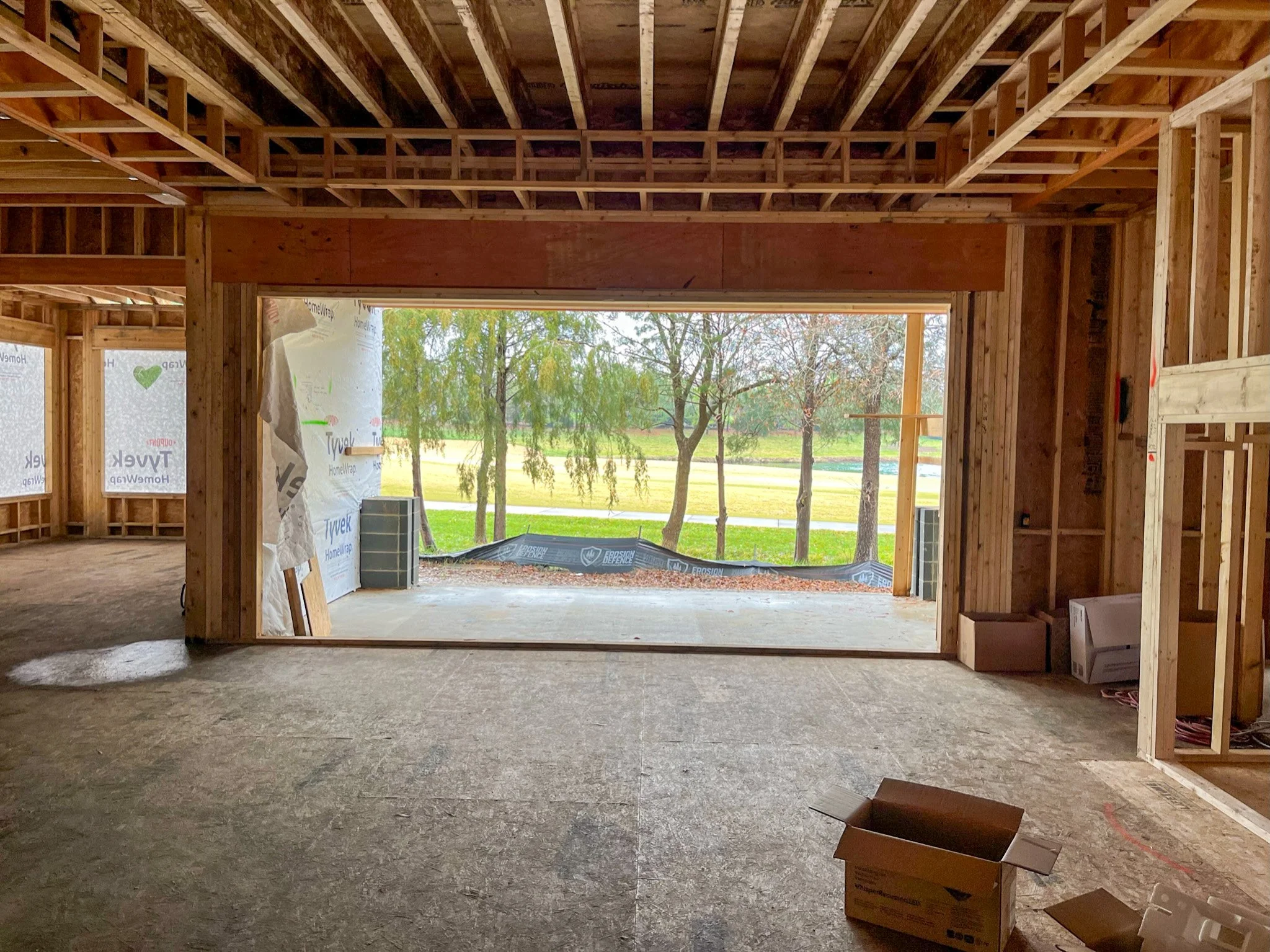
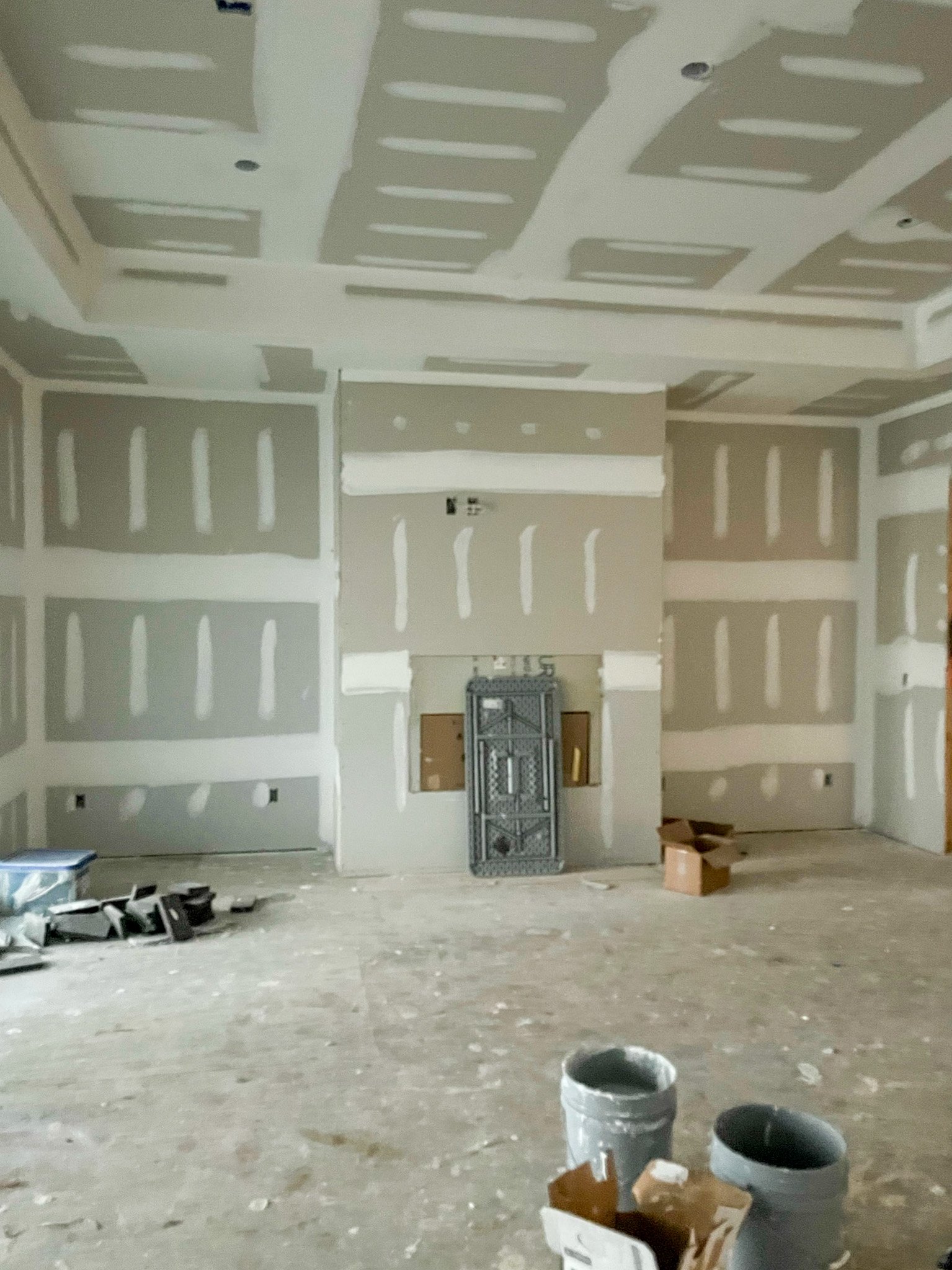
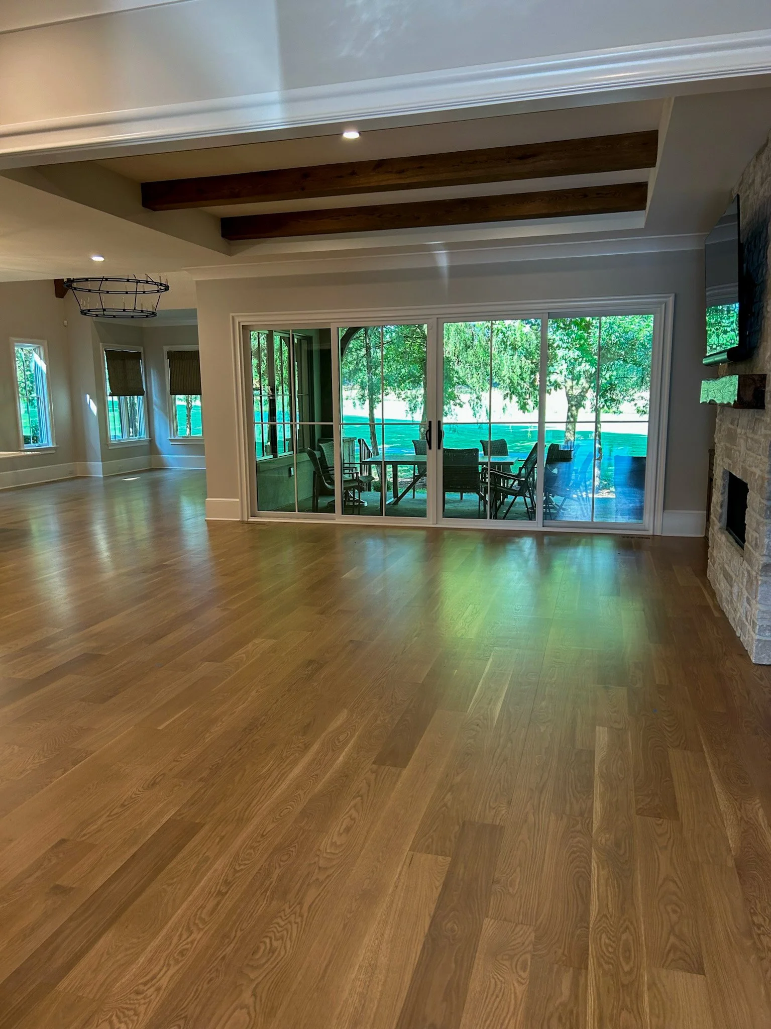
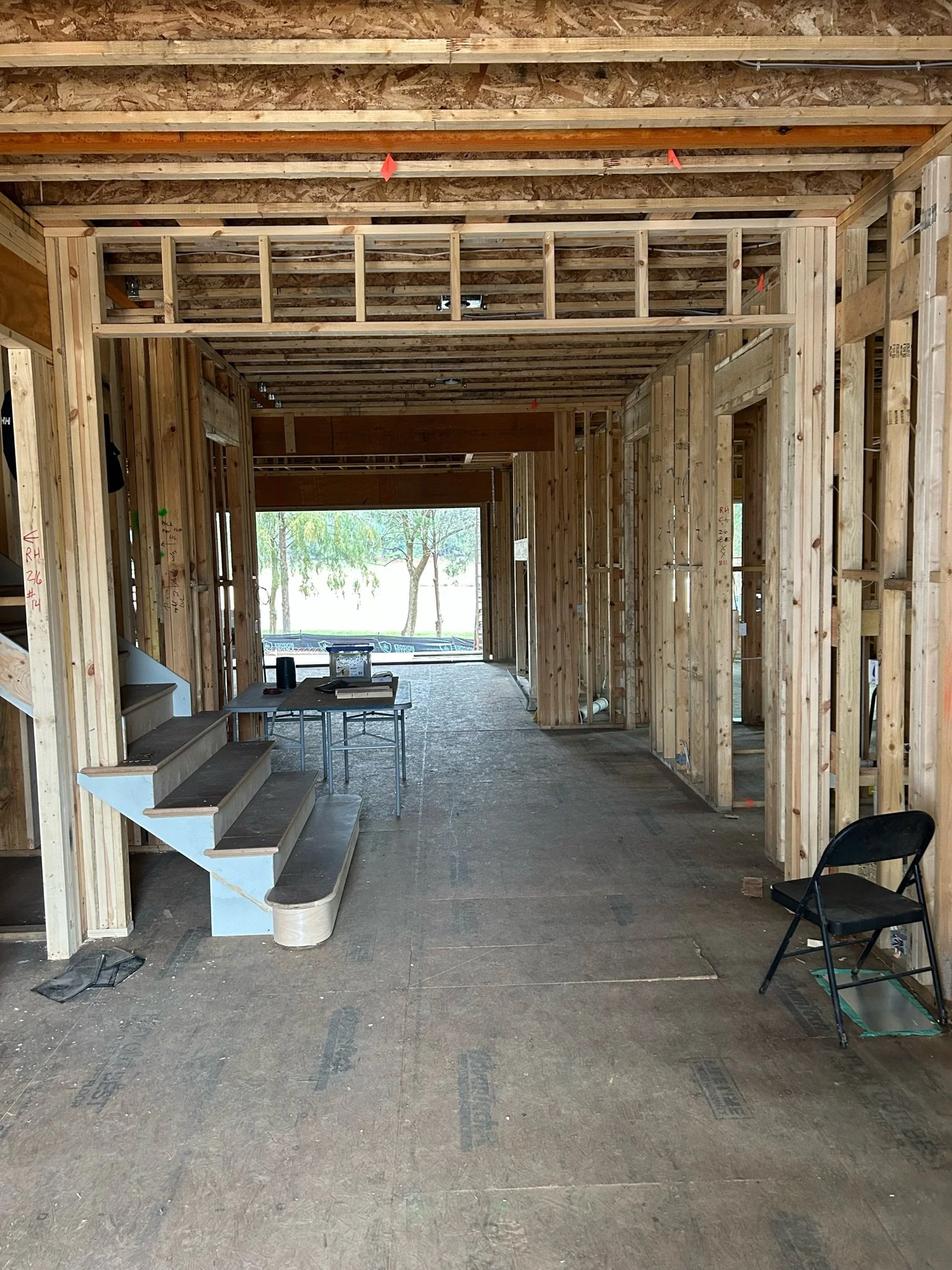
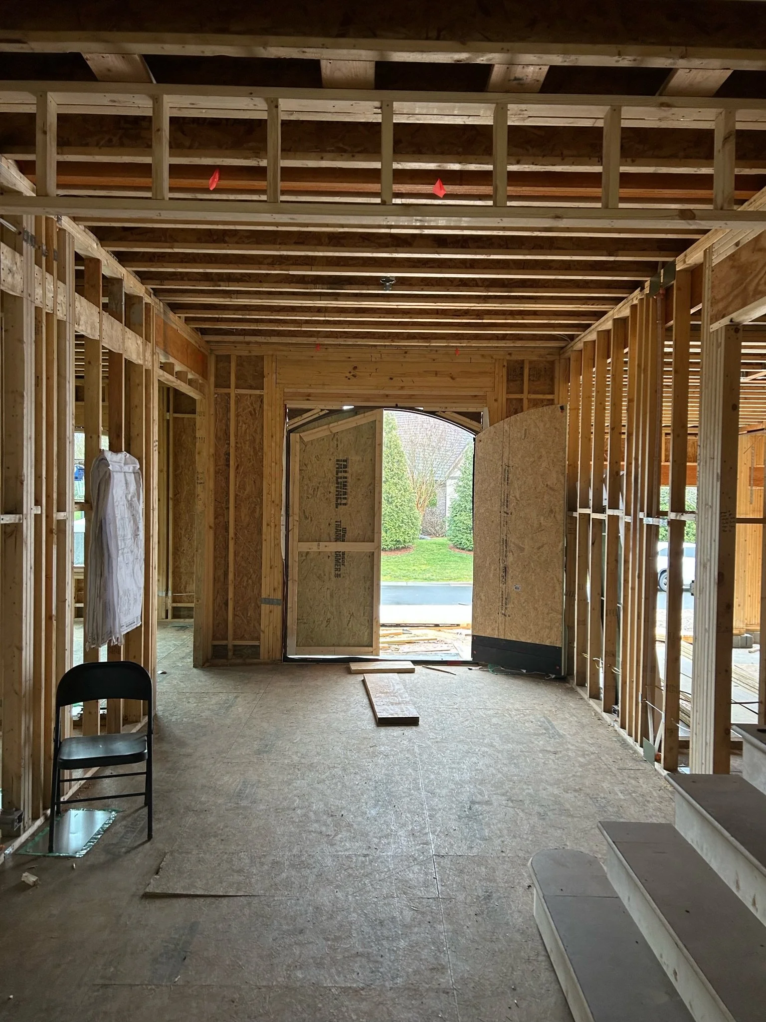
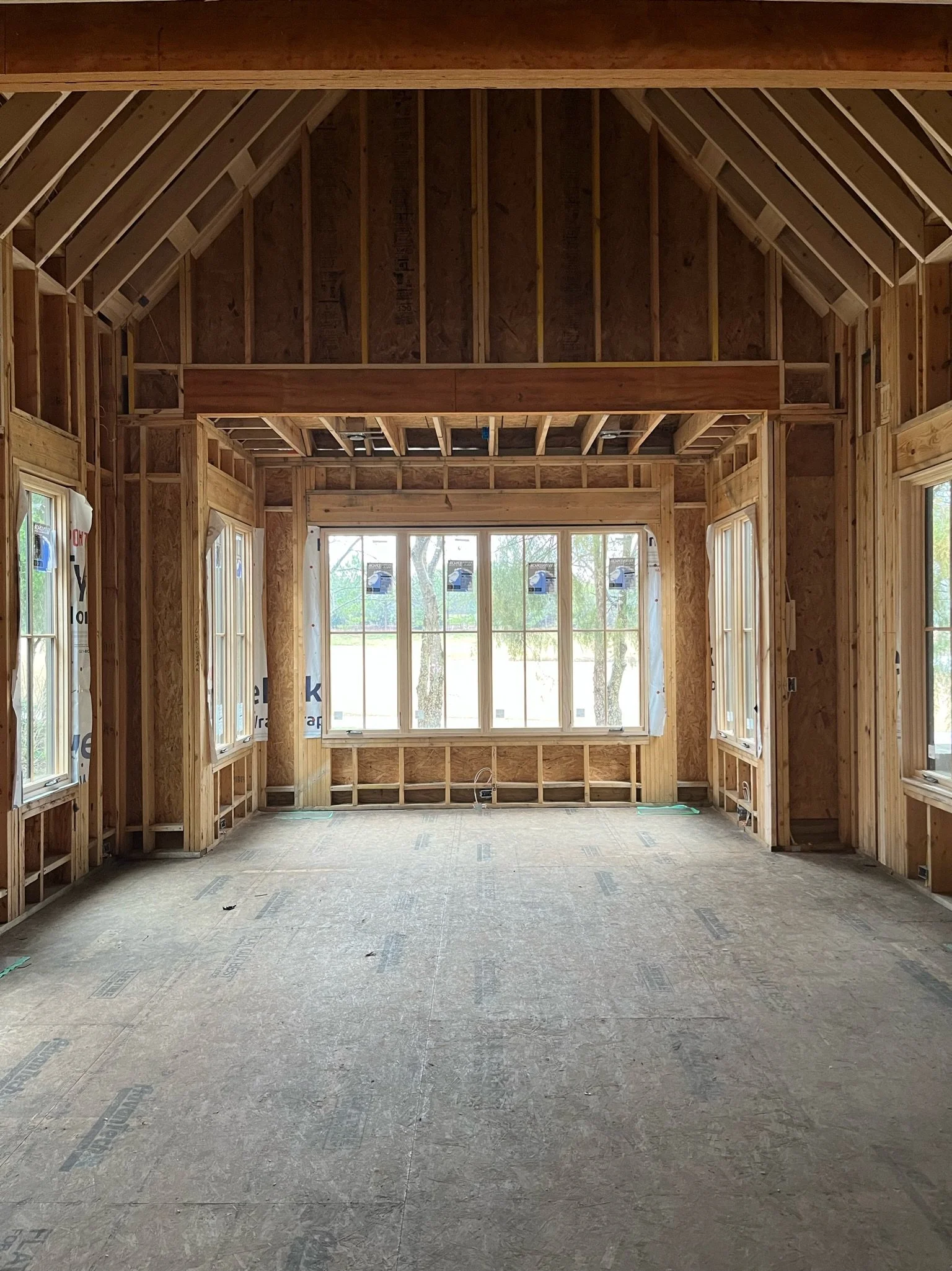
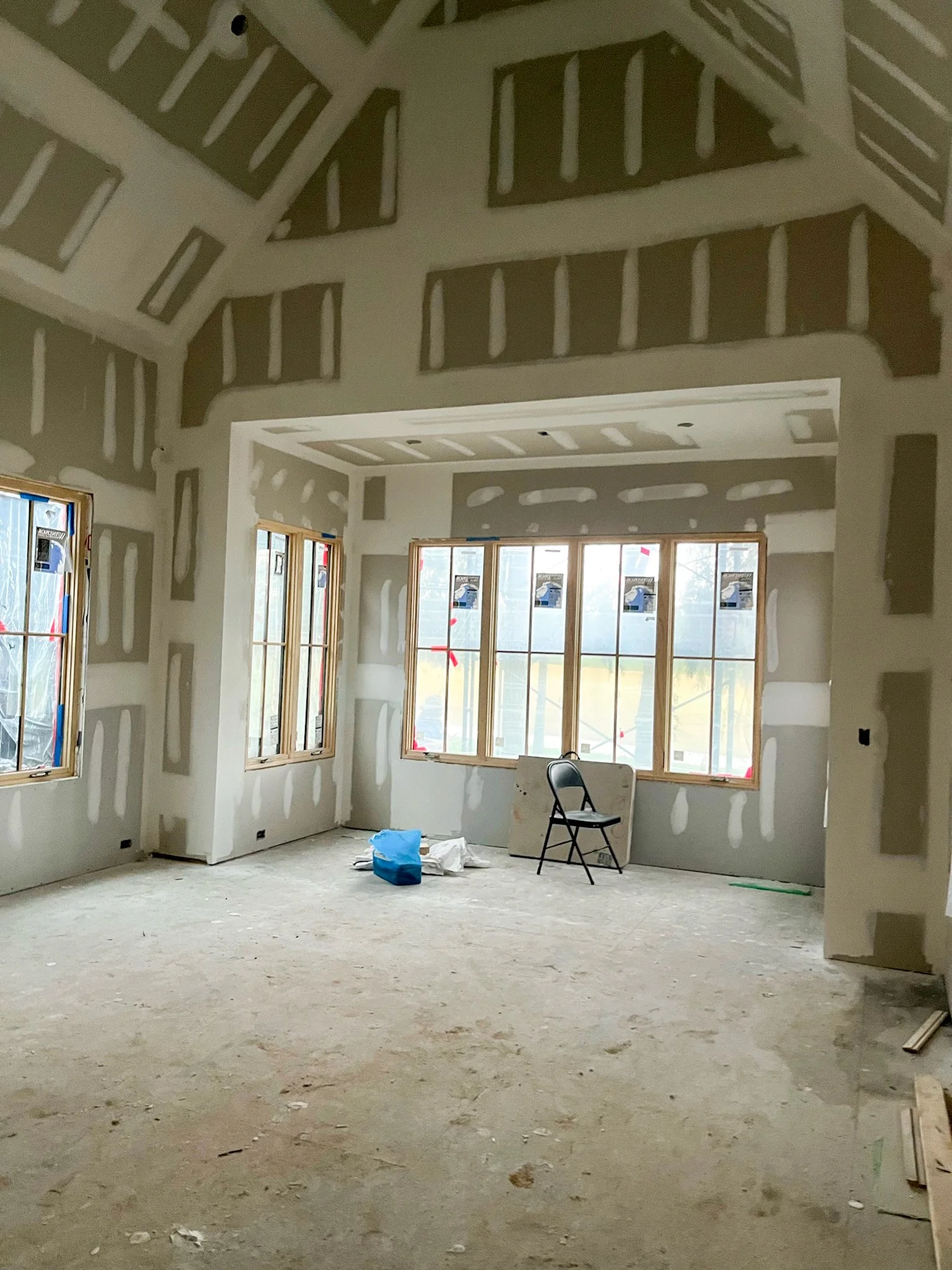
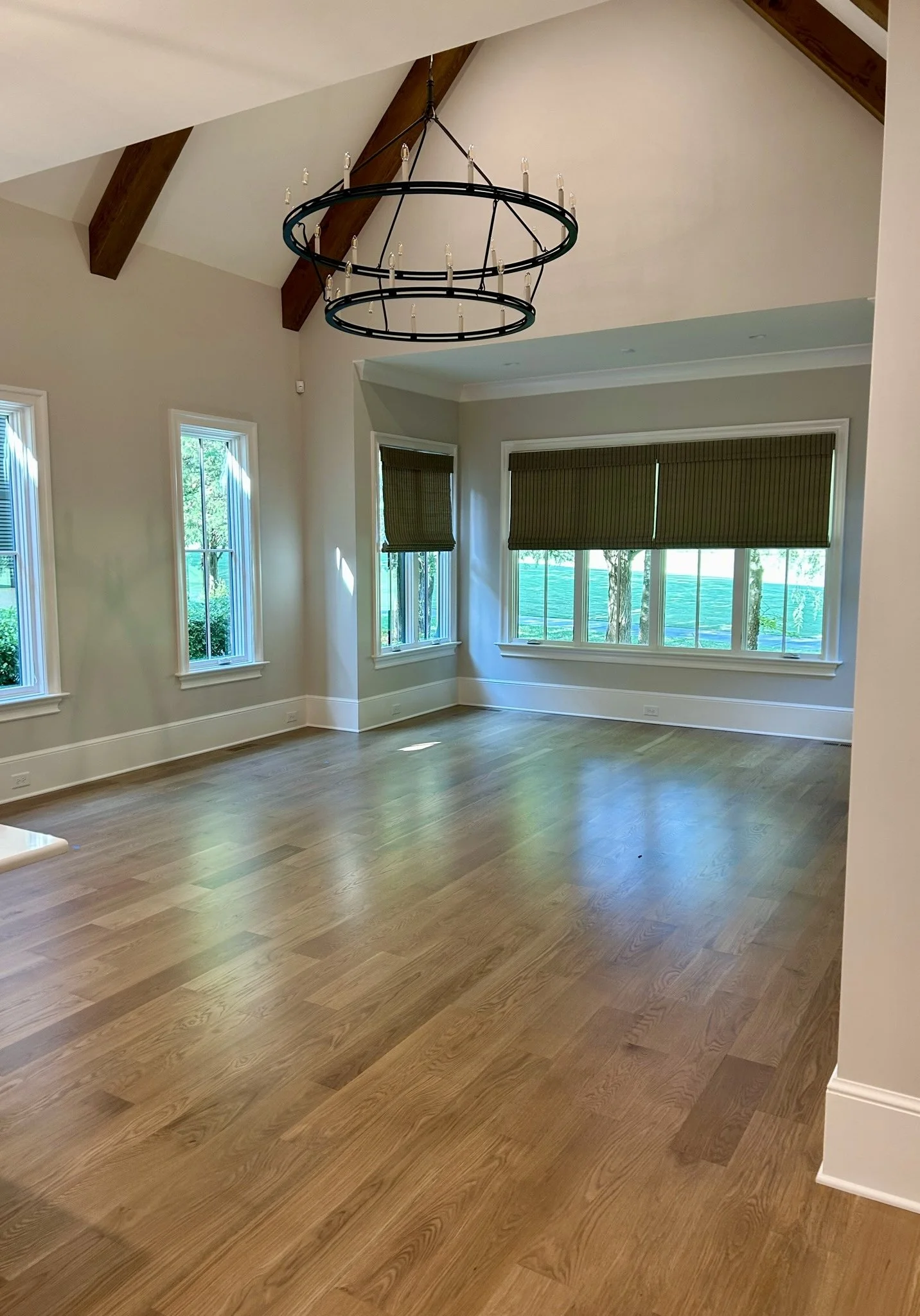
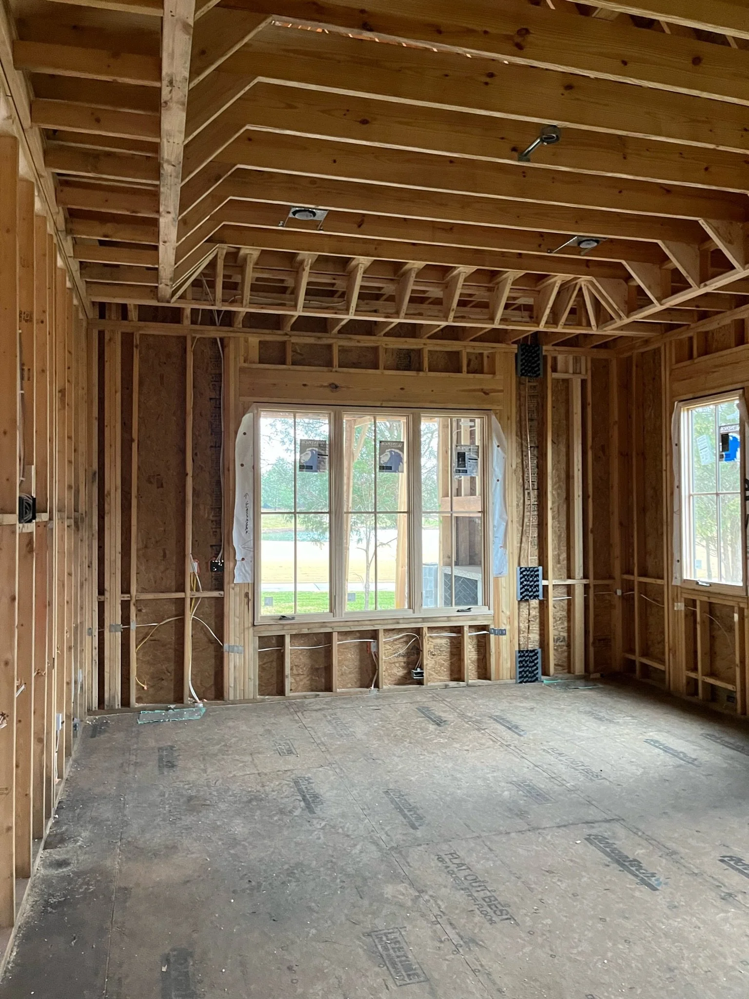
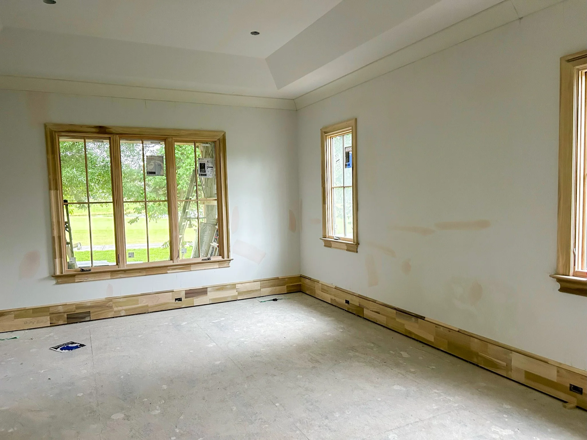
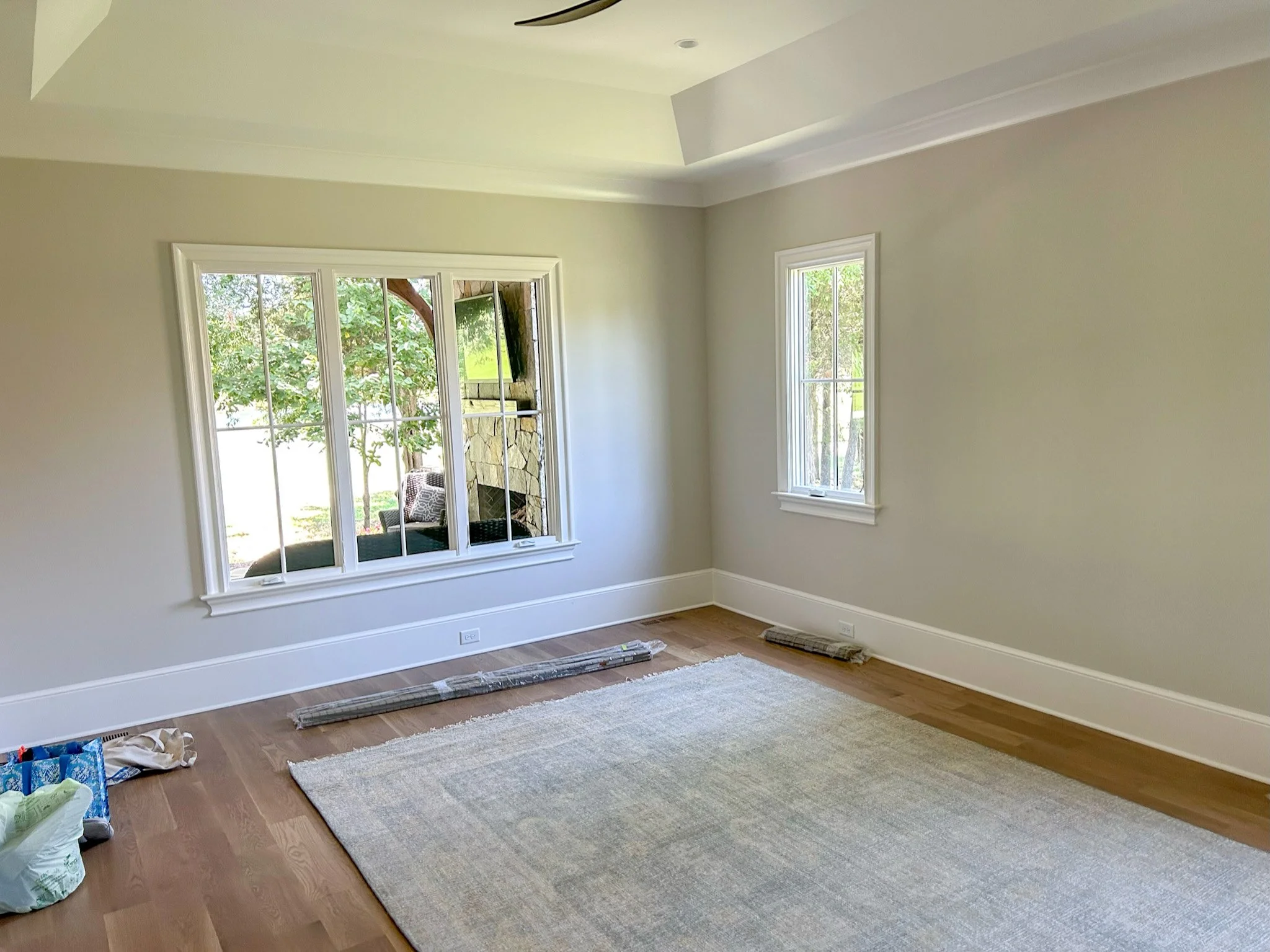
We are thrilled to finally be able to share the before and after photos from our Life On Longview project! This project is slightly different than some of our other remodeling projects as this was a new construction project. Our before pictures take you from the initial framing phase all the way to the completion of this beautiful home.
For this project, we had a partnership with local Charlotte builder, Arcadia Homes. We were hired to furnish our client’s dream home so that they could move in and immediate enjoy it.
This was a project of love. Also one that was so much fun as we got to enjoy the process from the ground up! If this home looks familiar, it’s because it was featured in SouthPark Magazine and the family room, bedroom and foyer are some of the top 10 most saved spaces on Houzz!
We hope you enjoy taking a look back on the process as much as we enjoyed furnishing the home!
Family Room
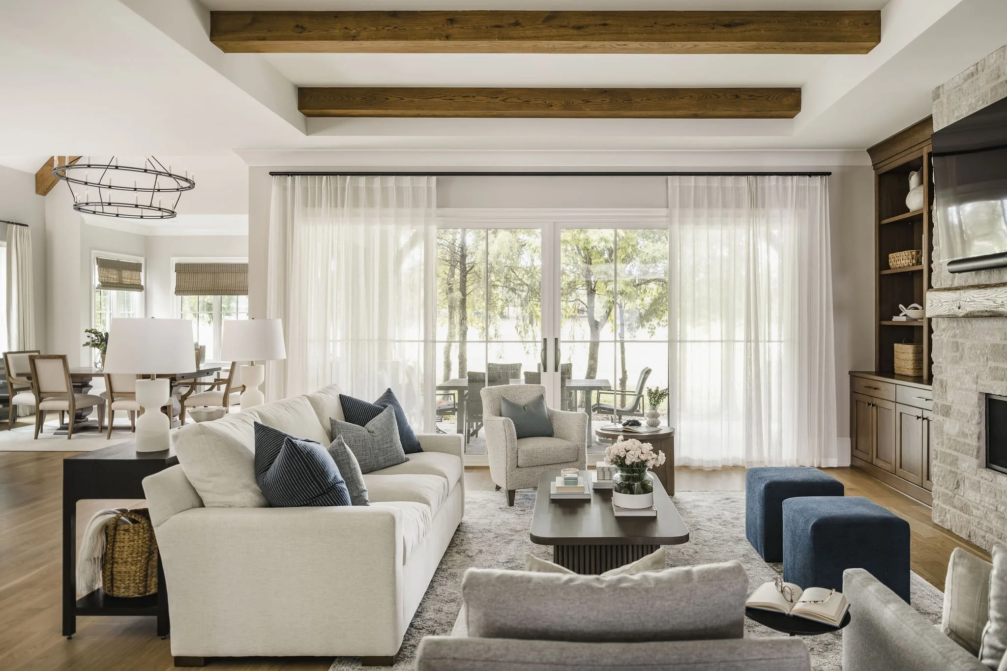
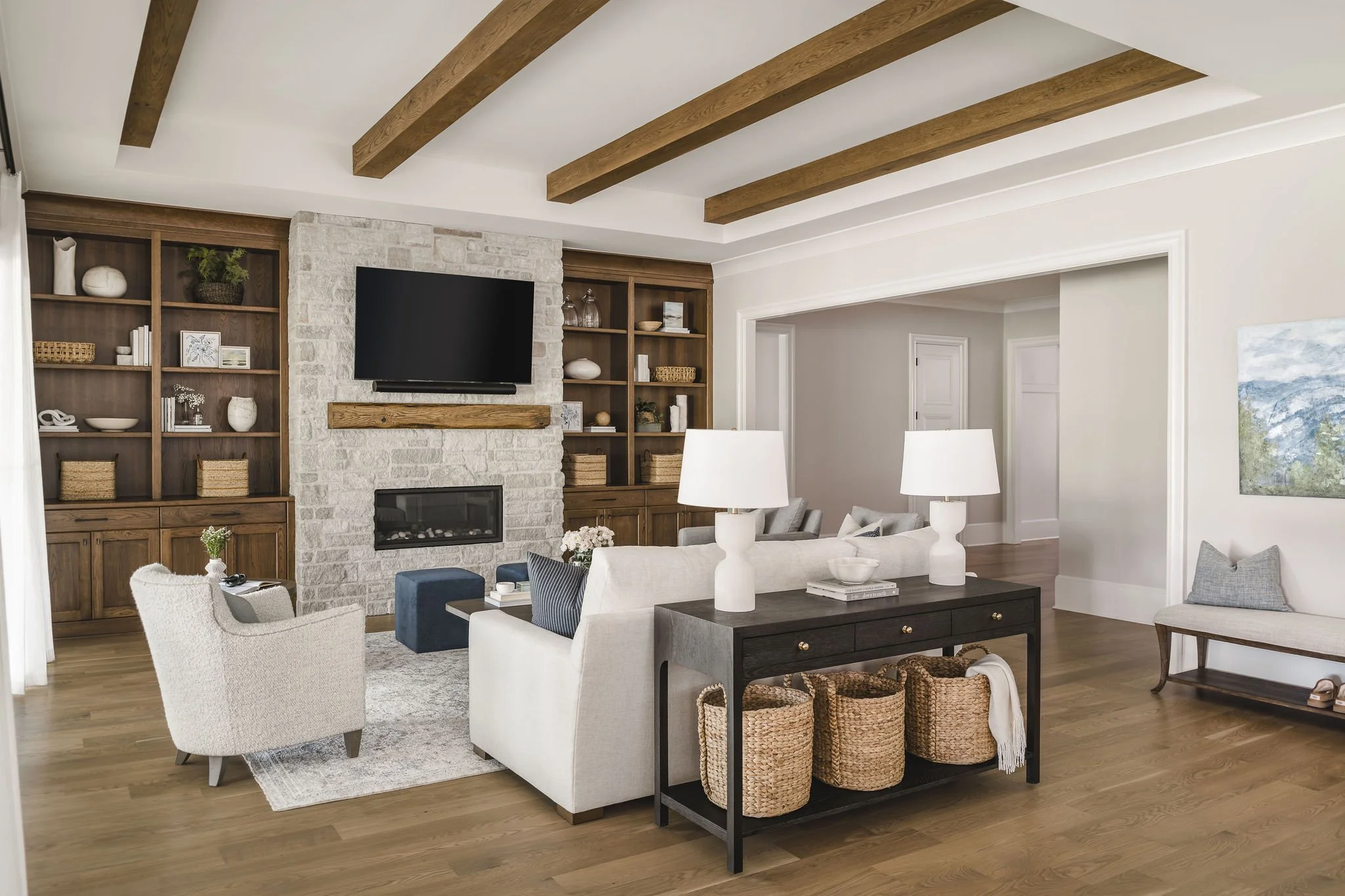
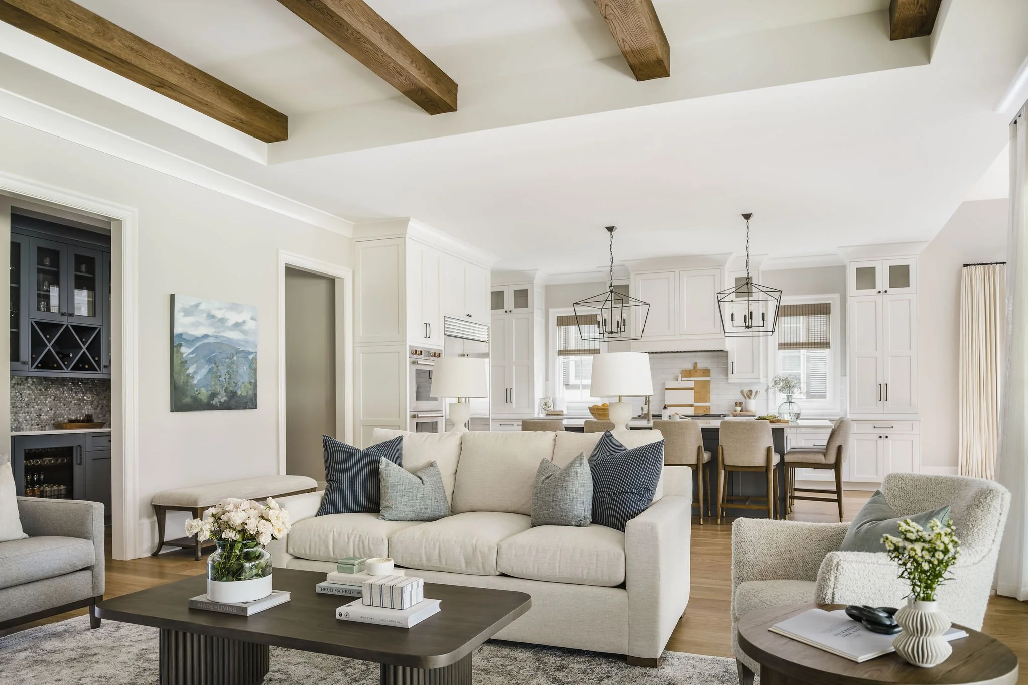
This family room was designed with the perfect color combination of warm and bright. Our clients wanted an open, yet cozy space and we achieved that by designing a space that our clients could relax and enjoy a football game and also host friends for cocktails. We centered the room around the stone fireplace, built by Arcadia Homes. We selected performance fabrics for the upholstered furniture, pillows and poufs for their durability and longevity. Due to the large sliding glass doors, this space had an abundance of natural light. Local favorite, Chancery Custom, made the 17’ custom sheers, perfect for filtering, but not blocking, the natural light. A highlight of this space was styling the built-ins. We incorporated artwork, sourced from local gallery, Arthouse Charlotte, as well as pottery made by our client’s mother, which added a special, personal touch. We really enjoy being able to incorporate both family heirlooms and new pieces into a space!
In one of the pictures above, you can see the gorgeous kitchen, designed by Arcadia Homes. We had fun selecting the pendant lights, window treatments, counter stools, as well as styling this space so that it was cohesive with all the surrounding rooms.
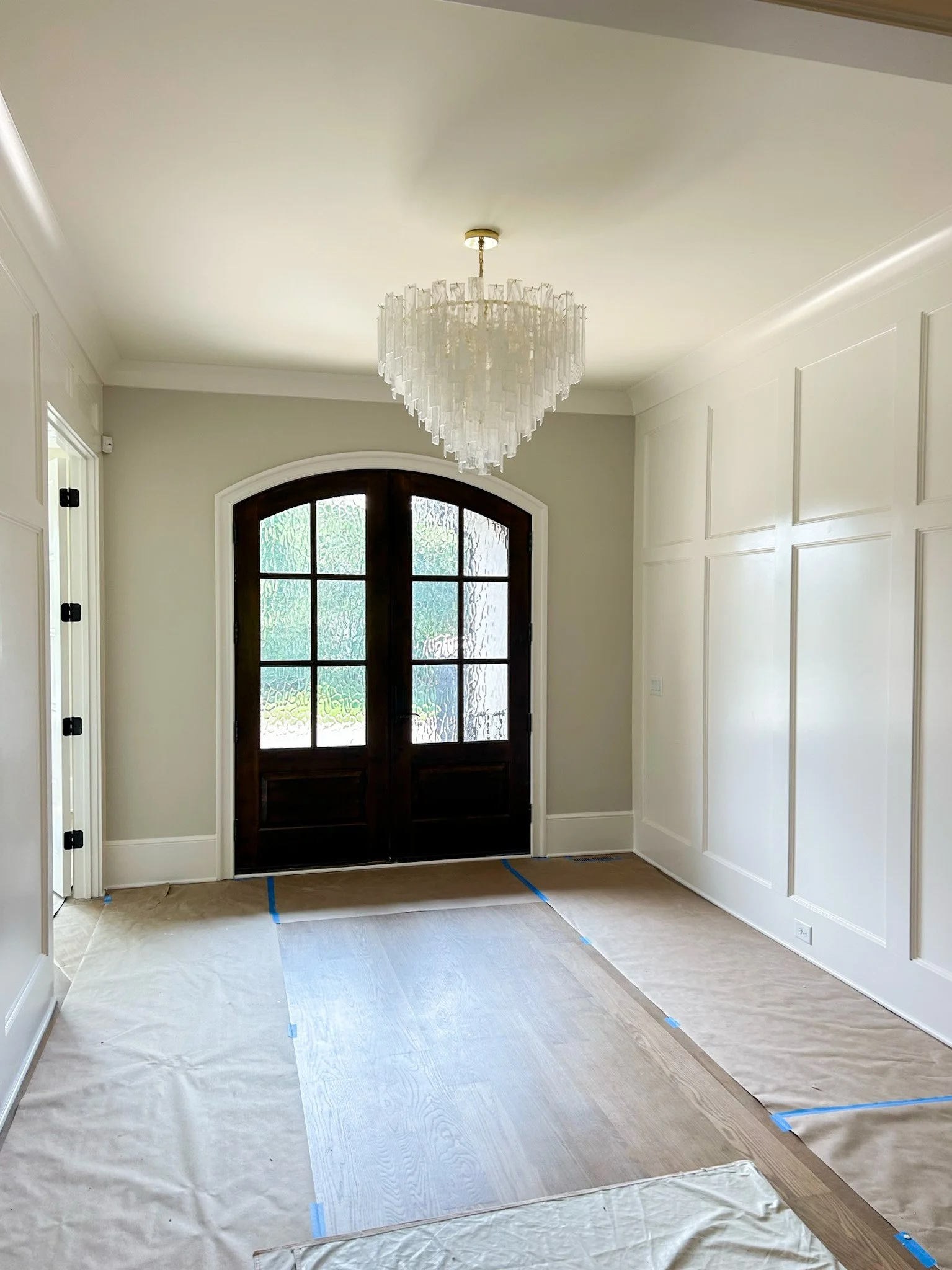
As you can see from the above progress shots, we were along for the ride as the home went from framing, to drywall, to completion!
Foyer
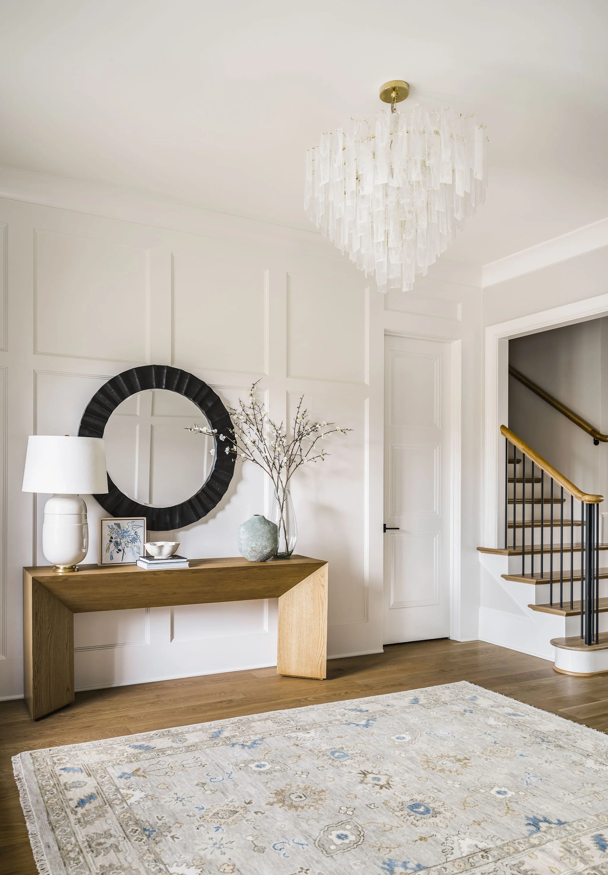
When you walk into the foyer you can’t help but think “wow!” The chandelier is a showstopper and we knew we needed to incorporate it into this space when we saw it. It also provides a ton of ambiance when it’s lit up - we wish we could show you! We balanced the printed oushak rug with a decorative black miror and sleek console adorned with original art and accessories. This space wouldn’t be the same without the beautiful arched double doors and is tied together by the custom millwork done by local expert, Ellis Reid Millwork.
Dining Room/ Sunroom
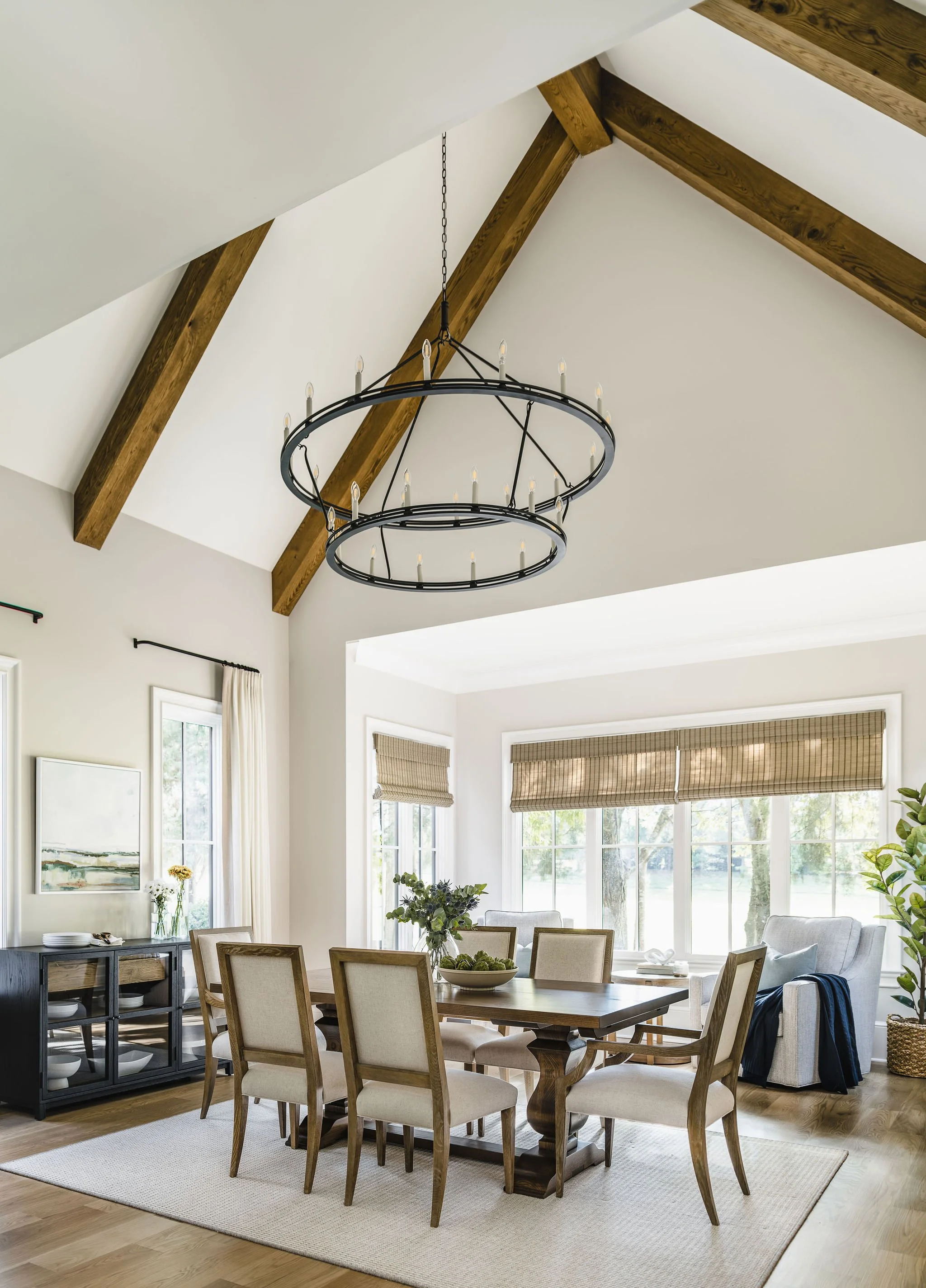
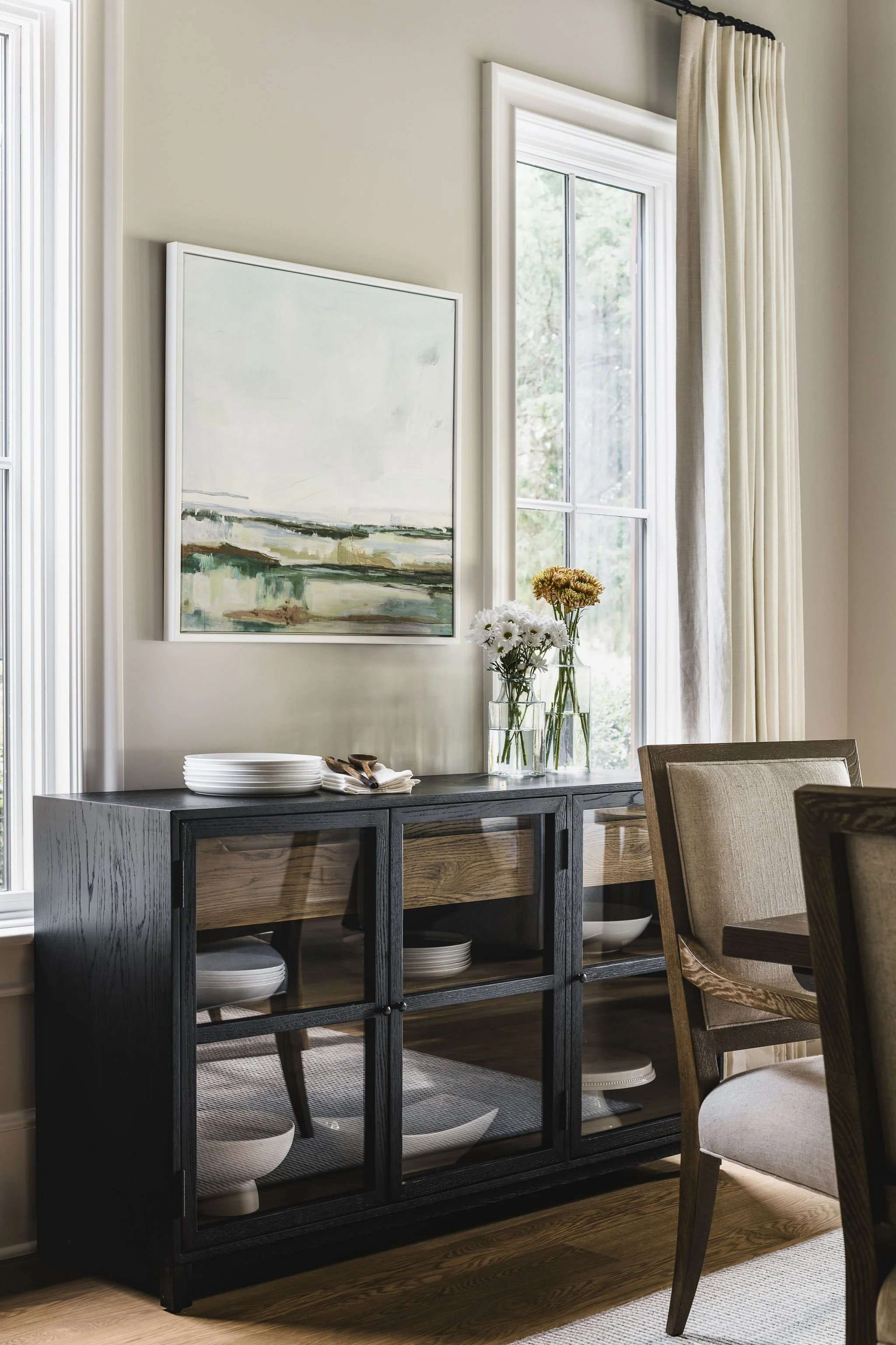
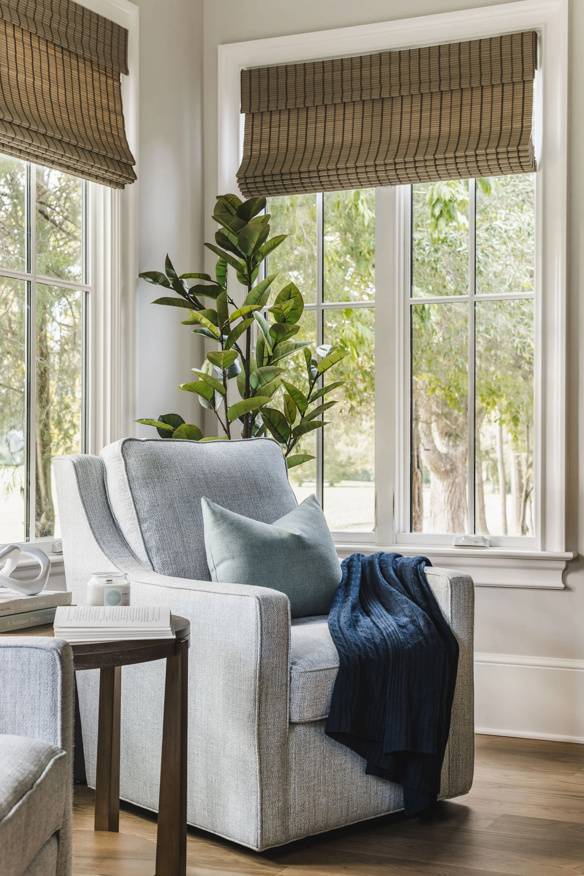
How fabulous are the vaulted ceilings in the dining room? We also have to highlight the beautiful custom ceiling beams by Ellis Reid. A favorite feature of ours is the extra-large chandelier. When working with open concept spaces, it’s important to create a “space within a space” so that you have some separation. We used the chandelier and the wool rug to anchor the “dining room” then accented the space with the table, chairs, buffet and window treatments. We created the feel of a separate “sunroom” by switching up the window treatments to woven Roman shades and chose upholstered swivel chairs to create a seating area where our clients could enjoy their morning coffee while watching golfers.
Primary Bedroom
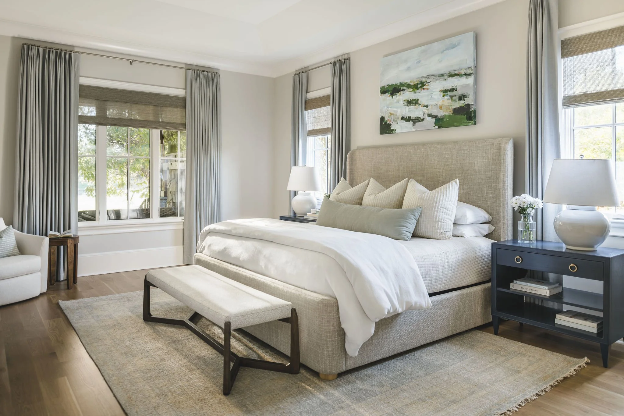
The primary bedroom is one of our favorite spaces we designed in the home! It really captures our signature bright and airy, yet refined design aesthetic - the perfect space to retreat to after a long day. We opted for an upholstered bed, navy bedside tables, large ceramic table lamps and an upholstered bedroom bench with dark wood accents. The bedding is made from the softest cotton, which in our opinion, is a major priority when designing a space that’s as functional as it is beautiful. We incorporated the abstract artwork by Pamela Wingard to pull the entire space together.

